Welcome!

This blog is where I'll be posting stuff from a class I'm taking at RPI, Graphic Storytelling.

Monday, May 9, 2011

Final Project

Here it is, the first 17 pages of a story that may in the future become much longer. Took many many hours of work both by hand with pencils and pens, and on the computer using Manga Studio EX4 and an Intuos3 tablet.

1

2

3

4

5

6

7

8

9

10

11

12

13

14

15

16

17

Monday, May 2, 2011

Final Project Update

One week until the due date of the final project--also the last class of the semester. I've had to cut down my story to 17 pages and remove much of the latter part of the storyline in order to make the deadline. Getting accustomed to a totally new computer program (Manga Studio EX4) has taken more time than I originally anticipated, although now that I'm getting the hang of it it's turning out to be a fantastic tool.

This first chapter now ends when Juno realizes that the girl she's found is actually a robot; I chose to cut off the story with Alice formally introducing herself. Stopping chapter 1 here is probably better for chapter 2, if it ever gets made--it will consist of what was originally supposed to go in chapter 1 (Alice's backstory, James's introduction, Juno's decision to flee the city with Alice), but I'll be able to take more pages to explain things by separating these events in their own chapter. Had they been in chapter 1, I probably would have crammed them into 10 pages or so to meet my deadline; in a totally separate chapter, I can take 17 pages to cover the material instead. On the downside, this makes the first chapter rather slow, and the story will not really begin until chapter 2. I probably should have planned this out better before jumping in, to avoid the slow pacing of chapter 1. At this point it's too late to make any major changes, but I'll keep this in mind when working on other projects or continuing this one.

Here are my sketches of chapter 1, the final project will basically follow these sketches. A few pages had to have their panels altered because I had issues creating the right layouts in Manga Studio.

Thursday, April 14, 2011

Manga Review: Azumanga Daioh


Azumanga Daioh by Kiyohiko Azuma has been published in many forms since its creation. It began in the magazine Dengeki Daioh (1999-2002), was collected in four volumes published in both Japanese and English (2003-2004), became a single volume omnibus edition published by ADV Manga (2007), and most recently was released as a newly translated omnibus edition by Yen Press (2009). It is this new omnibus that I chose to read--665 pages of black and white manga, with ten full-color pages interspersed throughout the book. After watching and enjoying part of the anime which was based on the manga, I was eager to read the original material.

The style of this manga is a sharp contrast from most other popular titles. With the exception of three chapters, the entire story is told using the yonkoma format--four-panel comics, with panels arranged vertically and read from the right side of a panel to the left. This particular version retained the original Japanese sound effects, with English translations inserted in tiny print next to the Japanese characters. A similar method was applied to Japanese lettering on signs and clothing, with translations appearing below the panels. The art style is very simplistic and cute, fitting the tone of the manga and leading the reader to focus more on the characters themselves rather than on the artwork.

A typical page from the manga.

The characters are truly the heart of Azumanga Daioh--five high school girls and two of their teachers make up the main cast. The manga begins when the girls enter high school, and concludes three years later as they all graduate (note: Japanese high schools cover the equivalent of American grades 10 through 12). There isn't much of a plot, but rather random scenes from everyday life are highlighted: exams, sports festivals, culture festivals, summer vacations, class trips, study sessions, etc.

Right from the beginning, it becomes clear that each girl has a unique personality that sets her apart from the rest of the group, and their differences are the focus of conflict and comedy.  There is Chiyo, the ten-year-old child prodigy; Tomo, the energetic loudmouth; Yomi, who rarely fails in her studies but always fails at her diets; Sakaki, calm and quiet and a lover of cute animals; and Osaka, an extremely odd new student who moved from the city of Osaka at the beginning of the series. Added to the group are two of their teachers: Yukari, who is almost like an older version of Tomo, and Minamo, the far more serious and responsible of the two. Very little backstory is given, but Azumanga Daioh isn't the kind of story that relies heavily on events of the past. All emphasis is on the events of the present and the interactions of the characters.

The story starts out as a very light-hearted comedy, and it retains this feeling all the way to the final page. Towards graduation time, there are a few moments of bittersweet nostalgia, as the girls are accepted into different colleges and begin to walk their separate ways. However, young Chiyo points out, "Even after graduation...we're still together." There isn't a huge moral lesson to be taught, or any overarching theme to take away. Read it simply for the enjoyment of it. Get to know the characters, learn their quirks, laugh at their comedic antics. I greatly enjoyed Azumanga Daioh, and I would absolutely recommend it to anyone.

Wednesday, April 6, 2011

Final Project!

For my project, I've decided to create an original story and draw only the first chapter, as the entire story would be far too long to complete by the end of the semester. I plan to create my comic by drawing images with pencil and paper, scanning them, arranging these pencil drawings in panels using the Manga Studio program, and finishing with lineart and shading in either Manga Studio or Photoshop. The comic will be black and white, styled similarly to Japanese manga (which makes it very interesting to draw pages, as the right-to-left format of manga has become second-nature to me and I have to concentrate on remembering that English goes from left-to-right). I was originally aiming for approximately 20 pages (around the length of a manga chapter released in a weekly magazine), but after sketching some pages and seeing how the story progressed, I believe the total page count may be closer to 25 or even 30.

The story opens by introducing one of the two main characters--an 18-year-old by the name of Juno Alexander. While walking home from work one night, Juno discovers a young girl out by herself, and attempts to help the girl get back home. But "home" for this child is a laboratory that she has just escaped from--she is not human, but a highly advanced robot called A.L.I.C.E., the Artificial Learning Intelligent Child Experiment. After hearing Alice's tale of torturous experiments and dreams of the outside world, Juno decides that no matter what, she cannot send the girl back to her creators. Juno's older brother James, however, has other plans; he believes Alice was stolen and fears that it would jeopardize his plans to become a detective if Juno refuses to return Alice and ends up with a criminal record. He calls the police, but before they arrive, Juno and Alice escape.

I will be the first to admit that writing is definitely not my strong point; I chose to use this idea because of the smaller cast of characters (Juno, Alice, and James) and the limited amount of time to complete the project. The names "Juno Alexander" and "James Alexander" have not been definitely decided on, they may still change before the project is finished.

Characters

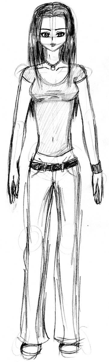
Juno Alexander: 18 years old. High school graduate, failed to get into any colleges. Recently moved from her parent's home in a city suburb to her older brother's apartment in the city. Intelligent, but slacked off in high school, resulting in very poor grades and nearly dropping out. Loud, kind-hearted, doesn't always think things through before speaking or acting.

A.L.I.C.E. (Alice): 4 years old, appears to be 10 or 11. An experiment to test the limits of artificial intelligence. Impossible to tell at first glance that she isn't human. Programming has not yet been completed, she is using the first prototype of her software and still has much to learn. Created by very nerdy engineers, her database contains a rather large amount of information about video games and comics, but her social skills are somewhat lacking. Shy, naive, very trusting of others.

James Alexander: 21 years old. College student, studying criminal justice. Plans to join the police force after graduation, wants to be a detective someday. Likes teasing Juno and pointing out her mistakes. Hard-working, stubborn, very strong sense of justice.

Sketches

Juno
First drawing.

 
Portrait

Practicing hair, different angles, different expressions.


Alice
First drawing (kinda messed up the profile a bit, need to practice that).

Pose practice.

Pages 1-9

Monday, March 21, 2011

Jim Steranko: "Harnessing Mythology: Reflections on Narrative Theory"

I greatly enjoyed reading Steranko's article; it was interesting to learn about the approach of a professional comic book artist/author. Some of the techniques mentioned were in fact techniques I frequently employ, such as viewing each scene "on the movie screen of imagination" or listening to music while working that corresponds to the scene at hand. But the portion of the article that struck me the most was at the end, where Steranko went through a page with panel-by-panel explanations. It was incredible to see just how important each line of each panel was--not a single one out of place. Something so easy to take in at a glance had an amazing amount of thought put into it. I personally have never given panel layouts very much thought, just tossing in characters and props almost haphazardly. As an amateur, I could easily see where my attempts at comic-drawing fall short compared to the work process of a professional. This article was both insightful and inspiring, and I plan to keep some of Steranko's advice in mind on my next project.

Tuesday, March 8, 2011

Past/Present/Future

On the right is panel 64 from Frans Masereel's "The City" (found here). On the left is an image I created depicting a possible "before" image to match Masereel's "after" image--the calm night sky before the storm of fireworks, with a single rocket shooting upwards to herald the upcoming activity. I also altered the house on the left side of each image; when the night appears calm, the house is quiet and still, but after the fireworks begin a woman looks outside to view the festivities. I chose to use a darker black for my image than the greyish-black in Masereel's image, to emphasize how much light the fireworks bring to the scene.

Poetry as Comics

For this assignment, students were to create 12-panel comics. Each pair of panels had to begin with "I used to believe..." and end with "...but now I know..." I chose to design my comic around important themes and lessons from popular manga and anime that I enjoy (that's what I get for looking at the word "believe" in the assignment description, and then looking at a picture of Kamina--believe in you who believes in yourself!). On each of the "...but now I know..." panels is the face of the main character of the series the text is referring to. Coming up with a concept was simple enough, but laying out the panels and the characters was far more difficult; I had trouble deciding if the panels should all combine into one image, or if individual images for each panel would be a better approach. In the end, I went with the one-image-for-all-panels idea, as it was easier to incorporate the characters using that method.

All characters belong to their respective owners. From the beginning of the comic to the end:
Light Yagami, Death Note
Edward Elric, Fullmetal Alchemist
Tohru Honda, Fruits Basket
Sena Kobayakawa, Eyeshield 21
Kamina, Tengen Toppa Gurren Lagann

Sunday, February 27, 2011

Blackout Poem

This assignment was rather fun to work on--take a newspaper article and a black Sharpie, and black out the unnecessary words in the article to create a poem. I found this article in a recent edition of the Poly, RPI's school newspaper. It was an article dealing with insomnia, which caught my eye because I'm no stranger to the curse of being unable to fall asleep. My only regret about this piece is that the article was printed in two narrow columns, and in composing the poem, I followed the natural reading order of the left column followed by the right. However, after shading with Sharpie, the columns disappeared, necessitating the addition of an arrow directing the reader's gaze. I would have preferred to not need the arrow, but overall, I was pleased with how the poem turned out.

Wednesday, February 16, 2011

Instructional Image

My attempt at making an image designed to teach someone a simple task. Instead of going with a step-by-step approach, I decided to create more of a general guide to transforming a realistic-looking anime character into a super-cute chibi character, or vice-versa. There's no specific order in which to use the advice presented here, but rather, an artist can work these tips into his or her own art style. The transition from normal anatomy to chibi anatomy was a difficult one for me, which is why I chose this topic for my instructional image. Not only did I get to practice my own technique while making this piece, but perhaps someone somewhere is struggling just as I used to and will find this guide helpful. Created in Photoshop CS3 with an Intuos 3 tablet.

Tuesday, February 15, 2011

Good & Bad Informational Graphics

Everyday, we see multiple images designed to instruct or inform. Some of these images are excellent for conveying their intended messages; others, not so much. Here is an example of an instructional image that I strongly believe belongs in the "bad" category:


These instructions (originally found here) are supposed to show the reader how to solve a Rubik's Cube puzzle. Unfortunately, all they do is add to the confusion. The images are all in black and white, with varying shades of grey to represent the colors on the cube; this is not nearly as helpful as it would be to see the cube in color. It is extremely difficult to sort out the words and images to figure out which set of images to look at next, especially at the top of the page where the text and pictures are so tightly intertwined. Seems as though they ran out of space to print the instructions, and just had to cram in pictures wherever there was a bit of open space. The text, also, is extremely grammatically incorrect. Just look at step 2: "The wayg of combinatoin on gecond laycr ia ghowed an below." I don't know what language that is, but it doesn't seem like English. Good luck to anyone trying to use this guide to solve a Rubik's Cube--I'm sure you'll need it.

This informational graphic, on the other hand, is one that I would consider good:


I came across this image a few years ago on DeviantArt. It accomplishes its intended goal not by specifically stating character traits to avoid or include, but by providing easy-to-understand examples of characters, and in the case of the Mary Sue, going extremely overboard to make the point clear. The images help to emphasize to the reader just what a Mary Sue is--an utterly ridiculous character with every possible desirable trait and absolutely no weaknesses whatsoever. Seeing these two characters side-by-side makes the differences between them quite visible. And below each picture, to wrap up the guide, is a concise statement about the character portrayed: on the left, "[a]n interesting, believable, well-thought out character with normal flaws" and on the right, "[t]oo perfect, beautiful, popular, powerful, and talented." I feel that this image is a very good way to learn what a Mary Sue is and see why they should be avoided.

Mind Map


This assignment was to create a mind map from a lecture or a TV show. Scientific shows were suggested, so I decided to create this mind map from an episode of the show Mythbusters. Three myths were tested on this particular episode:
  • Does a sinking ship create enough suction to drag nearby swimmers down with it?
  • Does the memory of a goldfish last for more than three seconds?
  • If a trombonist packed explosives in the mute of his instrument and detonated them while playing, would the mute fly out and hit the conductor?
All three of the myths were busted.

To create this mind map, I used a plain sheet of paper, a black pen, and various highlighters. While watching the show, I simply took notes all across the page, adding little sketches and color to explain concepts and organize information.

Monday, January 31, 2011

PoCom-UK-001

This hypercomic by Daniel Merlin Goodbrey and collaborators is a unique and remarkable piece. Read from right to left, the main story is a simple one--a man walks from his house to a store to buy milk. But one soon begins to wonder if that is indeed the main story, for this comic consists of several storylines all intertwined. For nearly each step of the man's walk to the store, additional comic panels above and below show seemingly unrelated events occurring somewhere else in the world at that moment. A chaotic group of people running past, a beggar on the street, a museum in the background--the tales of each of these, and more, are expanded upon as the man walks by.

My feelings about this piece are somewhat conflicted. On the one hand, I love the creativity of the comic. It seems as though the artist couldn't make up his mind which story to tell, so he just decided to go ahead and write them all in, with only a single panel connecting each side story to the main one. It's an incredible accomplishment, but it almost feels messy and more complicated than any story has to be. Perhaps if the side stories had more of an impact on the man walking to the store, it would make more sense, but at times I found myself wondering why a certain element was chosen to focus on--elements like a fly that the man stepped on, or a bottle discarded by the aforementioned beggar. There didn't seem to be much of a point.

However, if the point was to prove the possibility of creating a comic such as this one; if it was to demonstrate the usefulness of technology to create comics of infinite size and scope, impossible to accomplish through more traditional methods; if it was to comment on the sheer vastness of the world around us, and provoke thoughts of how a simple action can begin or continue a chain of events, whether we are aware of it or not--then well done, Goodbrey and company. Well done.

Tuesday, January 25, 2011

Hmm, so this is a blog...

I've never made a blog before, but it's a requirement for my Graphic Storytelling class. So, here I am! I'm thrilled that RPI actually opened up this class to people who aren't art or game design majors, I've been wanting to take it for pretty much forever, and now it's my last semester and I finally got in. :D I looove reading manga (Bleach FTW!) and I've thought for a while that it would be fun to try to make a comic of my own; I feel like I've got the drawing bit pretty much down, but arranging drawings to form a story is something else entirely...I'm terrible at it. ^_^;; Hopefully this class will help me out, I'm really looking forward to the rest of the semester!